Analysing a data set and deriving insights from the data point has two problems, firstly it is not easy to analyse the data set, as some points can be left undiscovered, as well as the data in the real life is too large to be able to analyse it manually. This is where data visualisation helps.
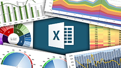
Data Visualisation is the graphical representation of data in the form of graphs, pie charts, geographic maps, infographics, line graphs and statistical graphs to analyse complex data sets. The goal is to communicate information effectively to a wide range of audiences, and to convey business information, data analysis and insights. You can explore the relationship between data points, and identify data patterns for the larger data set.
While venturing into data visualisation, remember these important guidelines.
- Create the shape, colour and size appropriately using data visualisation.
- Use a plot or graph with a coordinate system.
- Not every data visualisation works with every data set, so you should have the right knowledge on when to use what.
- Adding subtle points like labels, titles, and scales provide more information to the user than you think.

Data Visualisation using Tableau
Last Updated: 2022-04-25
Introductory Course on Data Visualisation using Tableau Desktop
If you want to work on exciting analytics and data visualization projects, then this is the starting point for you. Data is the currency of now and the potential to use it the right way, at the right time for the right reason gives you possibilities beyond imagination. UX in Data visualization is key in modern times to meet the expectation of your user, this course will highlight what are the benefits of using a good UX and how to do it.
So, how to do Data Visualisation in Python using MatPlotLib & Seaborn?
To understand this, we need to briefly know what is a MatPlotLib & Seaborn.
MatPlotLib: This is a popular Python library used for data visualisation, that can create a static, interactive and wide range of animated visualisations using a variety of tools and functions. Built on NumPy arrays, it has undergone improvements from open-source and provides well-maintained visualisation output with high-quality graphics.
You can install MatPlotLib using pip or conda, and after installing can import by using the following formula:
import matplotlib.pyplot as plt
You can create the following:
- create a figure with all the elements required for your plot, using the following formula:
fig = plt.figure() - Create a plot using any of the available plotting functions in MatPlotLib, like to create a line, use the code:
x = [1, 2, 3, 4, 5]
y = [10, 8, 6, 4, 2]
plt.plot(x, y) - Add labels and title using the following code:
plt.xlabel(‘X-axis label’)
plt.ylabel(‘Y-axis label’)
plt.title(‘Title of the plot’)
Finally, plot can be displayed using the following code:
plt.show()
Seaborn:
Seaborn is a Python data visualization library based on MatPlotLib. It provides a high-level interface for creating informative and attractive statistical graphics. Seaborn is built on top of MatPlotLib and integrates well with NumPy and Pandas data structures.
You can install Seaborn using pip or conda, and after installing can import by using the following formula:
import seaborn as sns
Seaborn provides built-in datasets that you can use to explore the library’s functionalities. You can load a dataset using the following code:
tips = sns.load_dataset(“tips”)
Seaborn provides several plotting functions that can be used to create different types of plots. For example, to create a scatter plot with a regression line, you can use the following code:
sns.lmplot(x=”total_bill”, y=”tip”, data=tips)
You can customise the visual appearance on plot using several customisation options.
Finally, to display your plot, use the following code:
plt.show()
These are some basic functions. If you want to learn some advanced functions, enrol on courses offered by professionals at Learnfly.


.jpg)